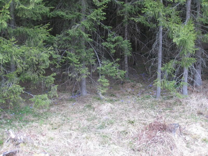
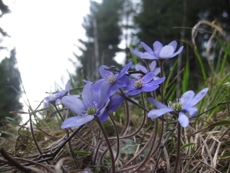
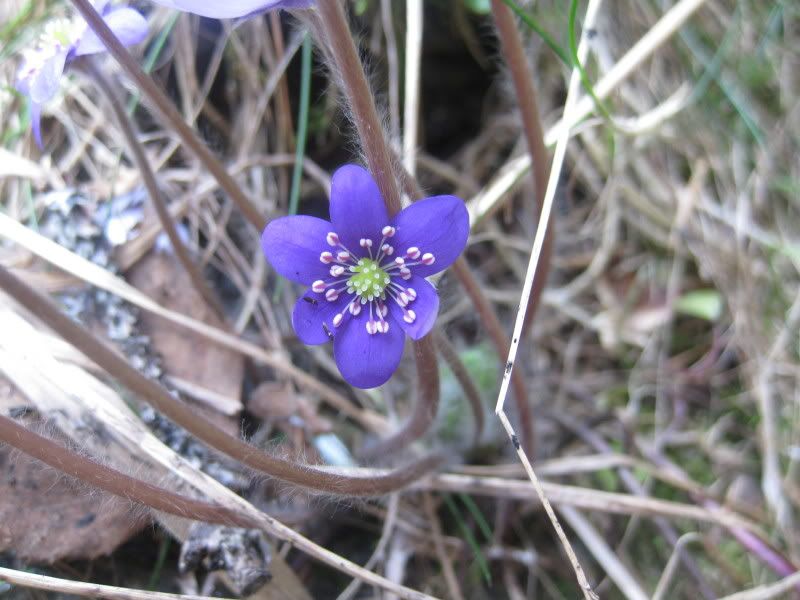
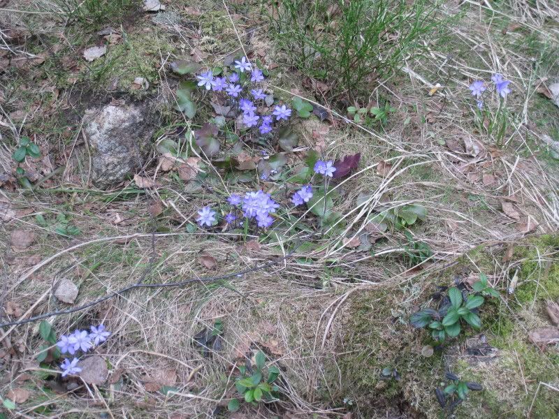
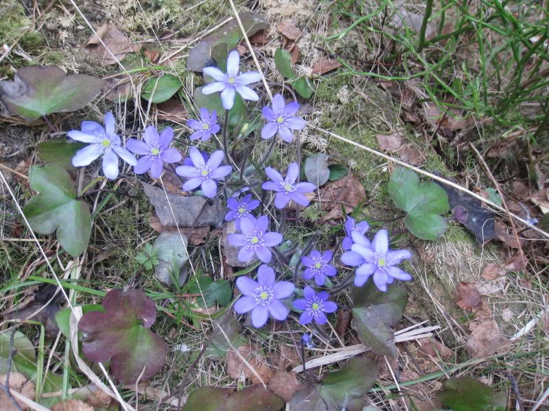
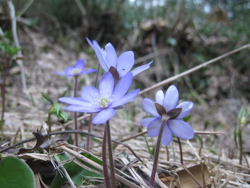
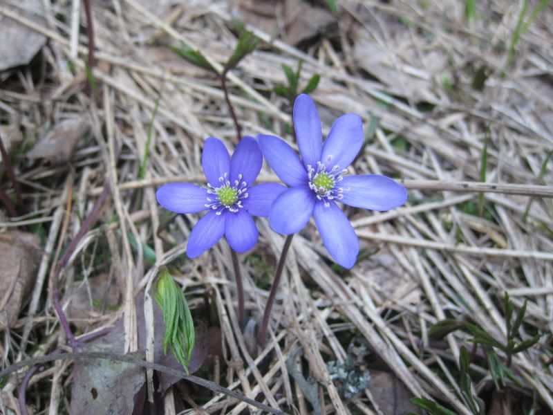
Another spring favorite 'round these parts - liverwort, Hepatica nobilis. In Norwegian it's called blåveis (blå meaning blue, obviously :-).
These pictures were all taken during a hike with my friend KAS in the woods by her house in late April. These flowers are difficult to photograph ... they have such a beautiful color, but they often come out looking very bland and almost colorless in pictures. Unfortunately. I took dozens of pictures on this hike but a lot of them weren't that good. These are the best ones. Some of them I'm very happy with. :-)


6 comments:
I love the last 2, on the camera thing is there a landscape setting for distant scenery and close up?
Yes, my camera has settings for those. I've been having fun lately experimenting with them. :-)
I really like that last picture too. I really caught the color in that one.
Hey Leisha,
I saw this today and thought of you:
http://www.nytimes.com/2009/05/14/business/global/14frugal.html?hp=&adxnnl=1&adxnnlx=1242275444-scuUjLsGex8MesZPcggJ7A
A and I broke up and I don't feel like blogging much, but I'll be back when I feel better.
Take care,
Margo
You guys broke up??? Aw, no!! I'm really surprised, I thought it was really working for you two. :-( That's such sad news, I'm so sorry. {{{{{Margo}}}}} Thanks for the article, though, it's quite interesting that they've run that. And in the printed edition too, apparently. :-o There are a couple of factual errors though ... I may have to blog about that article ... ;-)
Take care of yourself!! :-)
Looks like your camera does not do a very good job balancing the colours here. There was possibly not enough natural light?
Did you use any artificial light?
I've copied one of the photos (#5 from the top) into GIMP, and adjusted the colours - Cyan down a little (-5?); Mangenta and Yellow up approximately the same will produce picture without the IMO unpleasant purple-ish rendering of the greys in the background, and the blue-on-the-border-of-lilac-ness of the flowers as we see them.
Possibly setting the white balance would do the same, or using fill-in "blitz".
Of course, the real problem with these spring flowers are how we perceive their bright loveliness in the hard, barren spring landscape - too much of what we "see" goes on in the mind.
raagraaum: I wish I could say I entirely understood what you're talking about. ;-)
I used only natural light. The pictures were taken in the afternoon, at around 2:30-3pm.
Where can I see the copy you made and adjusted? I'd really love to see it. :-)
Very true what you say about perception and what we add to what we see. Especially in the spring around here - we are so starved for color at that time of year that when the first flowers arrive they really leap out at us. :-)
Post a Comment